
How to Efficiently Set Theme Colors Using Custom Swatches
When creating animations for your own characters or items in MOHO PRO, do you ever face these challenges?
- Choosing colors feels time-consuming
- The default color palettes don’t match your image
- Colors lose consistency during production
In this article, we’ll cover some basic MOHO PRO operations while explaining how to manage theme colors more efficiently by using color swatches (palettes).
Color Design Is Essential in Animation and Game Production
In professional animation and game production, the overall color scheme—including characters, items, and backgrounds—is usually decided from the planning stage.
- Image colors assigned to each character
- Balanced color tones depending on the scene (location, time of day, etc.)
If you decide colors spontaneously, the overall consistency of your work may fall apart.
👉 The key is to decide on colors as early as the rough sketch stage.
- Define base colors for each character or item
- Add variations for different scenes when needed
- Share the same swatch set when working with a team
MOHO PRO Color Palette Basics
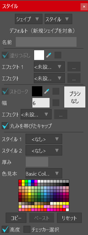
When setting the fill or stroke for a shape in MOHO PRO, you’ll use the Style window.
By default, the palette is set to “Basic Colors.”
The built-in color palettes include:
- Basic Colors
- Blue / BrownGray / Dusk
- Face / Skin
- Gradient
- Lake / Landscape
- NTSC
- Sakura
- Sky (day) / Sky (night)
- Red
- Underwater
- Urban
- Wheel
You can choose colors from these palettes, or use the Color Picker to select any color freely.
Set a “Custom Image” as Your Color Swatch: An Efficient Way to Manage Theme Colors
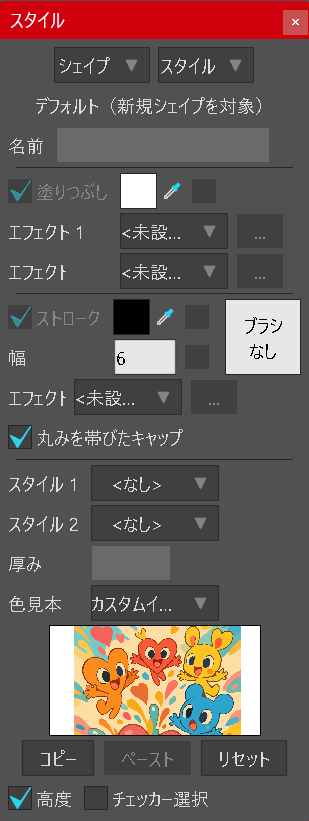
Steps:
- Prepare a color reference image (such as PNG) that summarizes the color scheme for your character or scene.
- In the Style window, select the color swatch option.
- Load your reference as a Custom Image.
Now, you can quickly pick the exact colors you need during your workflow.
Tip: The “Swatch” section will change to the custom image, allowing you to use the Eyedropper tool to grab colors directly from your reference illustration.
Benefits:
- Ensures high color consistency and keeps a unified look in your artwork.
- Makes team projects more efficient by sharing the same color reference.
- Prevents unintentional color shifts during production.
✅ Summary
In MOHO PRO, you don’t have to rely only on the default palettes. By using custom color swatches, you can work far more efficiently. Design theme colors that fit your characters and scenes, and boost the overall quality of your project.


